As Pelham Cares celebrated its 40th anniversary at the Meridian Community Center in Pelham, the organization unveiled a new look. “Our 40th anniversary was the perfect time to launch our new logo”, says Greg Lewis, President of the Pelham Cares Board of Directors.
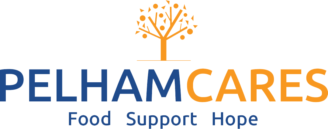
The new logo features a fresh, modern font coupled with the image of a tree. “Pelham is an agricultural community,” says Lewis,” and the tree symbolizes this, along with a nod to the iconic comfort maple tree in Pelham. Trees also represent growth and their fruit supplies food.”
The blue in the new logo is a link to the past, as this was the colour of the previous logo. The orange colour now used symbolizes fruit from the tree and highlights “cares”, which is what the organisation is all about.
Pelham Cares also introduced a new tag line “Food Support Hope.”
We introduced the tag line to state what Pelham Cares offers clearly and succinctly, adds Lewis. “Food is our main priority; however, we also offer support to our clients in other ways, including drives for medical appointments, youth sponsorships for sports, recreation and educational programs, toys for children at Christmas and for birthdays, hygiene and diapers, and referrals when needed to other Niagara agencies. And perhaps most importantly, we provide “Hope” to our clients.
“Our new logo and tag line represent the evolution of Pelham Cares, building on the past and looking towards tomorrow.”
For additional information regarding the new logo, please contact Greg Lewis, President Pelham Cares Board of Directors, at greglewishome@hotmail.com.
For more information about Pelham Cares, to volunteer, donate or to find out how to receive assistance, click here.
 Back to myNiagaraOnline